I recently reviewed a new API initiative from the Food & Drug Administration, called OpenFDA. I gave a whole list of things that they did right when launching the API, but one item that I thought was particularly interesting, was the actual interactive documentation for the Drugs API endpoint.
I talk a lot about interactive documentation for APIs, something that has become commonplace, and a building block that developers are starting to expect. What is different about the OpenFDA Drug API, is that the interactive documentation provides a visual interface for building API calls, going beyond the interactive, and often very form based documentation that is commonly seen in other developer areas.
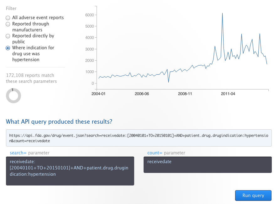
Via the OpenFDA Drug API documentation you can actually build an API query by selecting from radio button values, which then updates the resulting URL query, some summary text, and generates a graph visualization of the resulting query. After building your filter, you can run the API query, and see the request and response, which is a common feature other interactive API documentation implementations.
The addition of a visualization, that is driven by each endpoint is very interesting, and something I’d like to see baked into the DNA of interactive API documentation. Helping me build an API call, visualize and understand the value contained within an API has huge potential. Currently we have Swagger, API Blueprint, and RAML generated interactive documentation solution, which are pretty similar—I’d love to see more visualizations integrated into future interactive documentation implementations.