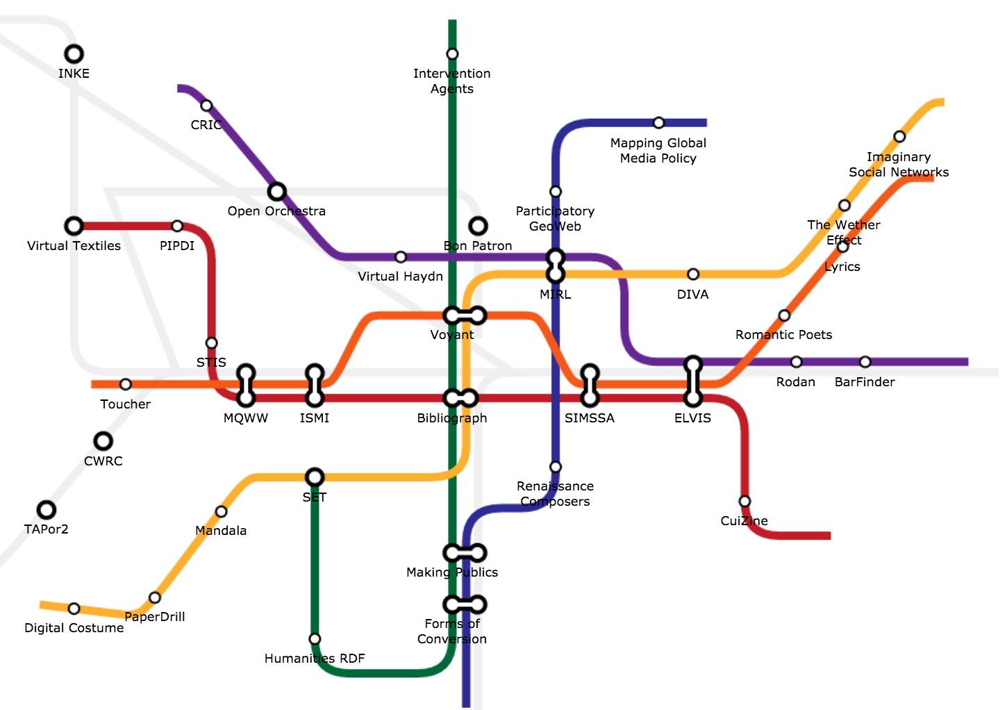
There is a new podcast on SoundCloud called APIsUncensored, from the folks over at SmartBear. I was honored to have a mention in the first episode, where they brought up a project I did a couple of months back, which I called the Subway Map API. I published a full story on what I was doing, and launched supporting Github repo, and API, but the work was very much a weekend side project, and something that will need a lot more love before it goes anywhere.
Ole Lensmar (@olensmar) admitted that when he introduced the project, he didn’t really get it, but ultimately in their segment, they accomplished what I was looking to do—stimulate conversation. The Subway Map API isn’t about the ideas I plotted on the map for API Evangelist, it is about the format for grouping, and mapping out iof deas—then evolving them through conversation. Don’t get hung up on my groupings of API design, deployment, management, etc., because my mission is to help introduce people to the world of providing and consuming APIs.
The goal of the project is to provide a platform where anyone can step up and frame a conversation about the lifecycle that means the most to them, their company, their products, and industry. When I first published the proejct, I quickly sent it out to two groups:
- 3Scale - Life-cycle to 3Scale is about helping people manage the APIs they’ve deployed, and I will be helping create a v1 map, based upon great work that Manfred has done on this subject.
- SmarBear - Life-cycle to SmartBear is about helping people monitor, test, and understand the APIs they posses, and if you guys have any stories on your blog to help me see this vision, I can help translate into a map.
Don’t get hung up on the maps I created, and don’t even get hung up on it being a subway map. As Ole mentioned you can add bus routes, train routes, etc. Via the API you can control the color, shapes, direction, connectors and labels for every aspect of the map. If you want to draw a straight line with 10 dots in a row, go for it. If you want to draw a big circle with 10 stops along the way, going all the back to the beginning, go for it.
The Subway Map API project was a fun thing I did for the weekend, and was looking to jump-start the conversation, something I think I did–eventually I’d love for someone to build an interface for facilitating this conversation. John Musser nailed it when he articulated the overall objective, and that is to create the most meaningful visual as possible, to help someone understand a Wycliffe related to the world of APIs. Think of John’s series of hockey stick API growth charts, or his API business models diagrams, these have become ubiquitous in API discussions, and if you create the next generation one for API design, deployment, management, integration, or other—you win!
I’ll work on a video response to go with this story. I’m neck deep in API-micro-service-docker-land, and don’t have the bandwidth to pull head up, I love the conversation!