Some of the side effects of being so open and transparent about my ideas, like the one I had around API visualizations, is that people who are doing similar things, like Ardoq, eventually find you. Even better, is when someone closely follows your thoughts, and takes your ideas, and sets into motion, your original idea, in a way that will allow it to become bigger than the original idea.
Last week Chris Spiliotopoulos (@chefarchitect) sent me an email, with a simple Chrome extension attached, asking what I thought. After installing the add-on (just drag onto your Chrome extension page), I visited my notebook of Swagger defined APIs over at API Stack, and when Twilio’s Swagger definition loaded in the browser, I saw a little Swagger icon show up in my browsers address bar—you know kind of like when there is an RSS feed available.

I click on the icon, and a new layer to my browser opens up, with a simple, crude, yet potentially powerful visualization of Twilio’s API surface area.
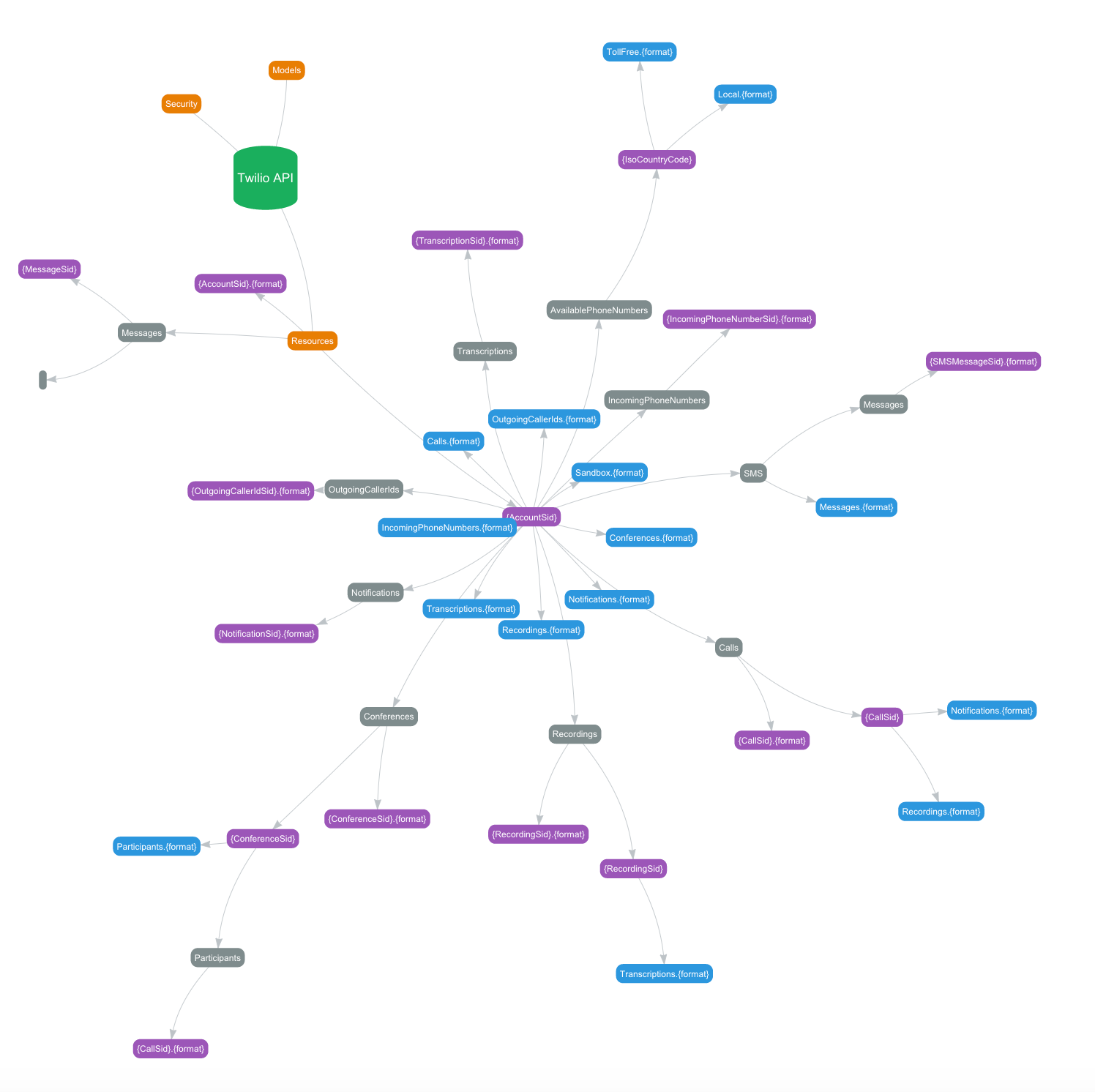
Honestly, the visualization does little for sorting out the complexities of the API, but it demonstrates a possible future, where we can browse the Internet, stumble across APIs, and their machine readable definitions, and open up an entirely new, visual layer that helps us quantify, and make sense of what an API does. APIs are a very abstract concept, and helping developers understand the scope and value of an API can be difficult, the introduction of API definition driven visualizations go a long way in helping speed up the conversation.
Imagine being able to immediately understand the scope of a microservice. How big is micro? Can I see a tag cloud of parameters? Is there a visualization layer to explore the underling data model? Can you provide me with a visualization diff between two similar APIs, defined using Swagger or API Blueprint. I’m just getting going on brainstorming ideas for visualizations, and so is Chris—a conversation that I think will be never-ending as we continue to work to understand the digital resources being deployed across the API landscape.
I have an alpha version of an APIs.json and Swagger editor, that I’m using for the redesign of my platform using microservices, and don’t just see the conversation Chris is started exclusively being about visualizing on the meta layer of APIs, but also directly connecting and exploring the valuable data, content, and other digital resources being made available via APIs. I also envision being able to explore collections of APIs defined using APIs.json, allowing not just software to navigate between many APIs, but also humans—something that is core to the APIs.json vision.
Swagger.ed is open source, and available in a Github repo. It is just an initial prototype, but imagine what is possible when you can take a machine readable Swagger or API Blueprint file, and instantly explore the meta layer to any API, then also visually explore data returned, like the FDA is doing with clinical drug trials. If you have any visualizations you’d like to see, feel free to submit as an issue on Chris’s work, or in the comments here. I would love to better understand how visualizations can better help you understand your own APIs, and the APIs that are littered across the online landscape, thta you depend on.