I was going through the SendGrid API and profiling their available plans and pricing, using my new API plan tracking format, and I just have to stop and say–I wish everyone would present their pricing pages as simply as SendGrid does. I cannot speak to whether their pricing is good, fair, or otherwise, but the layout, and the way they explain it, is very simple straightforward and easy to make sense of.
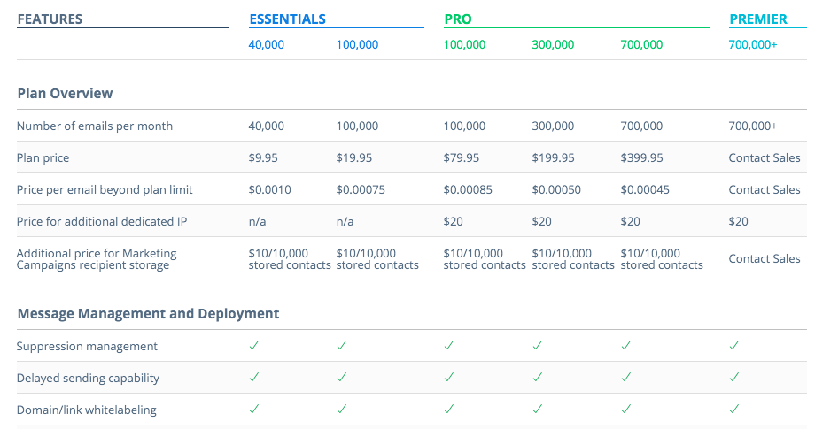
In addition to having the pricing for their email API broke down into six coherent plan tiers, they also have a compare plan details table which shows all six plans, side by side, with each core feature, and other elements of API access available to browse. As an API analyst, it make the data entry for my API tracking much easier, but as an API consumer it make it much easier for me to budget for the API driven resources I will need as part of my API operations.
The state of your pricing page tells a lot about how baked your overall API strategy. I will be the first to admit my own API plans and pricing are half-baked at best. I’m still trying to figure out what I want to be, the value of my resources, and what the market will bear–my pricing page reflects and amplifies this dilemma. This is something I am determined to get into order, as I continue to push forward my API plan research.