If you follow my blog at all you know I love Noun Project icons. I started using them with my last minimal website design, and is something I’ve carried over with the latest edition. I’ve been using some images for so long I even started reworking, remixing, and making my own images, to help me tell my API stories.
I find it difficult to conjure up just the right image, or images, to represent many very abstract API concepts, so it is something I am constantly working on alongside my research, as well as writing. As I was working on the content for a workshop I am doing at Davidson College this month, I wanted to have a simple, icon-based way for expressing just how open an API is (or isn’t). My first crack at coming up with an icon set, breaks things down into three distinct groups.
API (Flowing)

API (Just Is)

API (Not Flowing)
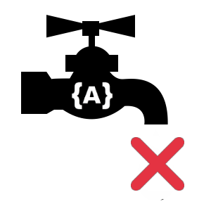
My objective here is to provide a quick and easy way to help articulate how open an API is or isn’t. Right now, these icons are set manually by me, based upon my overall feeling of the platform, the access they offer (or don’t), terms of service, and overall business model. This will evolve in the future, as I have a lot of data that could also influence these ratings, but for now, it is all me. (Mwahahahaaaa)
In this particular use case, I want to help university students better understand the many types of APIs, but in the future I’d like to evolve the ranking, and the icon set to be more meaningful, and apply across all of my research, anywhere you come across an API. I also just like playing with icons, and using my mad graphic design skills (not).
Full Disclosure: The faucet idea was Audrey’s idea, but she doesn’t like the faucets I ended up using–maybe I’ll switch them out with another set in future.