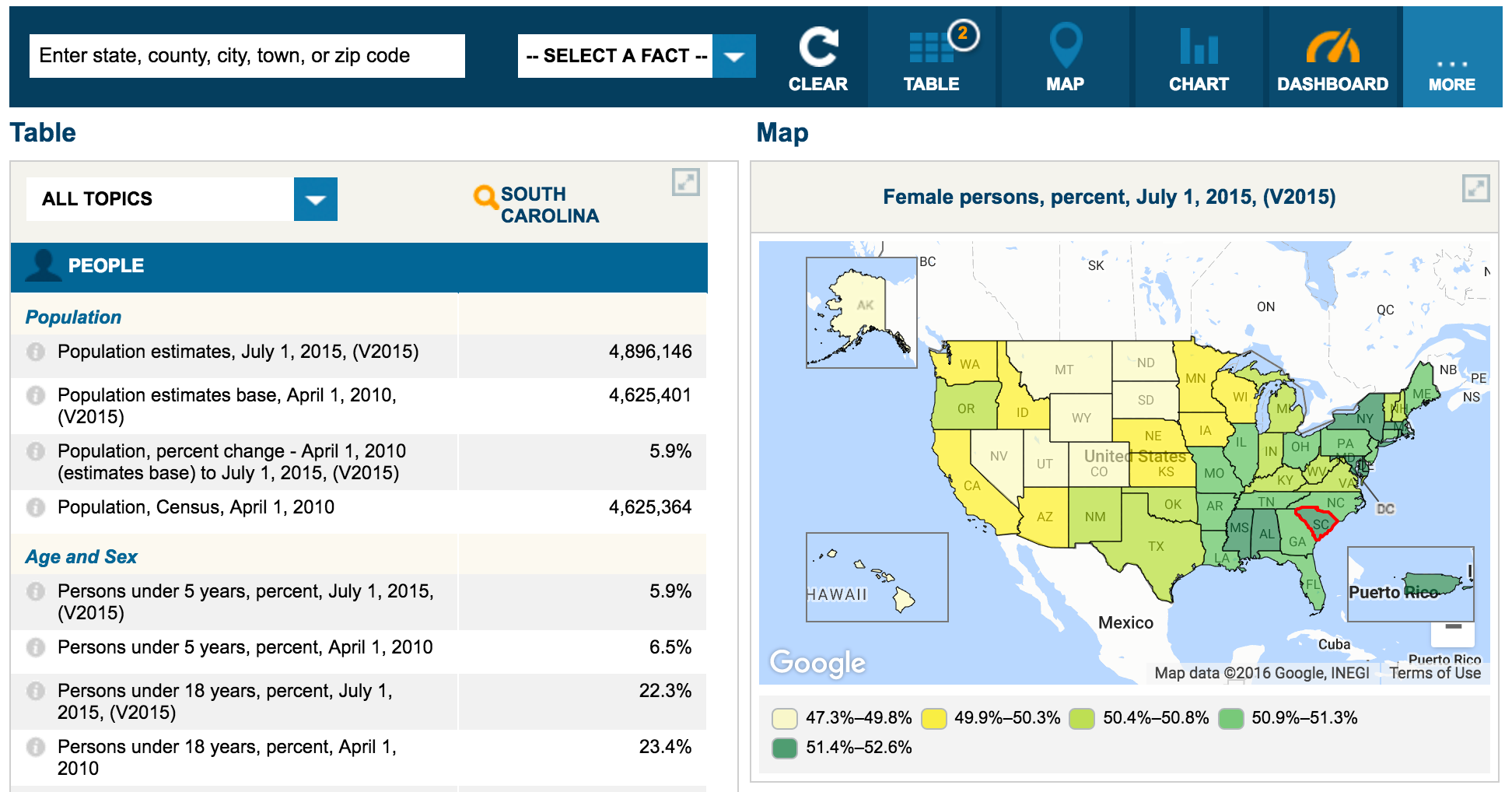
I wish every time you came across facts and statistics in any news story, blog post, report, and beyond, there would be an interactive experience like you get with the US Census Bureau’s QuickFacts tool.
QuickFacts provides statistics for all states and counties, and for cities and towns with a population of 5,000 or more, and provides everything I think you need to make the case behind any facts and statistics you are presenting.
Using the tool you get a table, chart, map, data download, email results, and share via popular social networks as well as embeddable tooling. The QuickFacts experience should be a default for all storytelling around open data.
The Census team has clearly worked very hard to make a wealth of very complicated data much more accessible, usable, and easily understood through proven approaches to telling stories using open data.
If you are in the business of publishing open data and APIs and building analytics and visualization tools, follow the lead of the US Census Bureau, and develop easy to use API tooling like the QuickFacts solution.