Spotify recently updated the available design resources and branding guidelines including their logos, icons and colors in their developer portal. I’m a big fan when any company has a dedicated page driving their API branding strategy, as it makes it easy for me to find logos, and understand how a company wants to be presented in my stories.Â
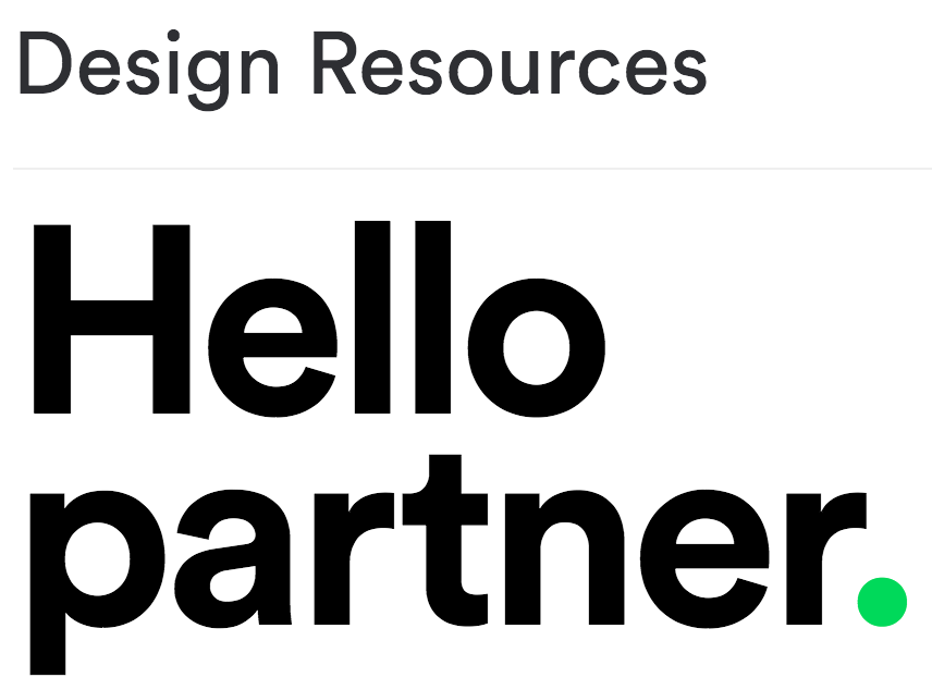
Spotify provides a range of design resources including logos, icons, display rules, minimum size, logo misuse, colors, fonts, and restrictions–all elements I’ll consider adding as branding building blocks for API providers. I also thought that Spotify’s quick description of their design resources is worthy of showcasing:
Welcome to our hub for partner guidelines and assets. We want to make it easy for you to integrate Spotify in your app while respecting our brand and legal/licensing restrictions.
Their design resources page for the API developer portal simple, and describes the important balance between API provider and consumer when it comes to a company and platform’s brand. I’m adding Spotify’s design resources to my listing of branding page for API providers–it provides a healthy reference of how it can be done in the music industry.
Additionally, I think the closing page for the Spotify design resources page has a couple more lessons:
If you are having trouble with anything in this guide, you are missing brand elements from the brand package, or you are unsure if your communication best represents the Spotify brand, please contact the Spotify design team.
I would add contact information, and suggestions, as two new elements to consider when crafting a branding page. I have a handful of other branding pages from the API providers to review. I’ll continue posting stories about each one (if worthy), as I mine them for other helpful elements that API providers might want to think about when crafting their own page.