Interactive API documentation is nothing new. We’ve had Swagger UI, and other incarnations for over five years now. We also have API explorers, and full API lifecycle client solutions like Postman to help us engage with APIs, and be able to quickly see responses from the APIs we are consuming. In my effort to keep pushing forward the API documentation conversation I’ve been beating the drum for more visual solutions to be baked into our interactive documentation for a while now, encouraging providers to make the responses we receive much more meaningful, and intuitive for consumers.
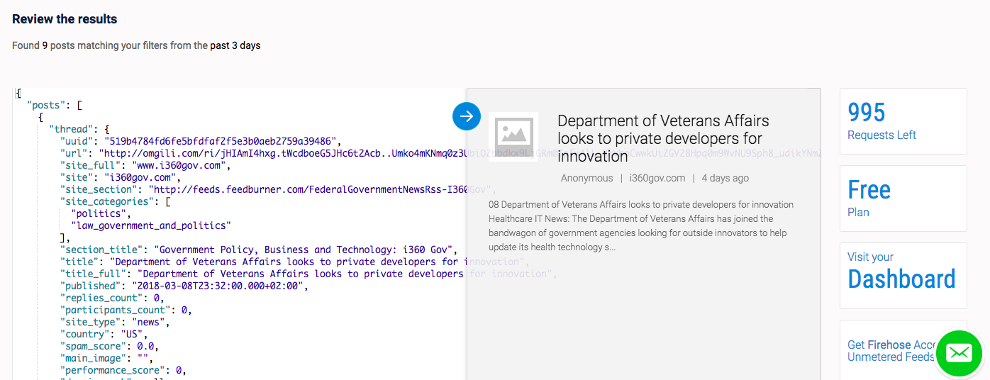
To help drum up awareness to this aspect of API documentation I’m always on the lookout for any interesting examples of it in the wild. There was the interesting approach out of the Food and Drug Administration (FDA), and now I’ve seen one out of the web data feeds API provider Webhose.io. When you are making API calls in their interactive dashboard you get a JSON response for things like news articles on the left hand side, but you also get an interesting slider that will show a visual representation of the JSON response on the right side–making it much more readable to non-developers.
It provides a nice way to quickly make sense of API responses. Making them more accessible. Making it something that even non-developers can do. Essentially providing a reverse view source (view results?) for API responses. Taking the raw JSON, and providing an HTML lens for the humans trying to make decisions around the usage of a particular API. View source is how I learned HTML back in the mid 1990s, and I can see visualization tools for API responses helping average businesses users learn JSON, or at least make it a little less intimidating, and something they feel like they put to work for them.
I really feel like more visualizations baked into API documentation is the future of interactive API docs. Being able to see API responses rendered as HTML, or as graphs, charts, and other visualizations, makes a lot of sense. APIs are an abstract thing, and even as a developer, I have a hard time understand what is contained within each API response. I think having visual API responses will help us craft a more meaningful API request, making our API consumption much precise, and impactful. If you see any interesting visualization layers to your favorite API’s documentation, please drop me a line, I’d like to add it to my list of interesting approaches.