I was reading the news about “BandPage raising $9.25M to help musicians reach and monetize billions of fans worldwide” today, which in itself isn’t all that exciting. Sorry, while VC investment in companies that have APIs is a relevant data point, I just don’t think its newsworthy enough to warrant its own blog post, usually just a tweet.
One thing that I did find interesting in this post, was the image depicting the distribution via the BandPages platform:
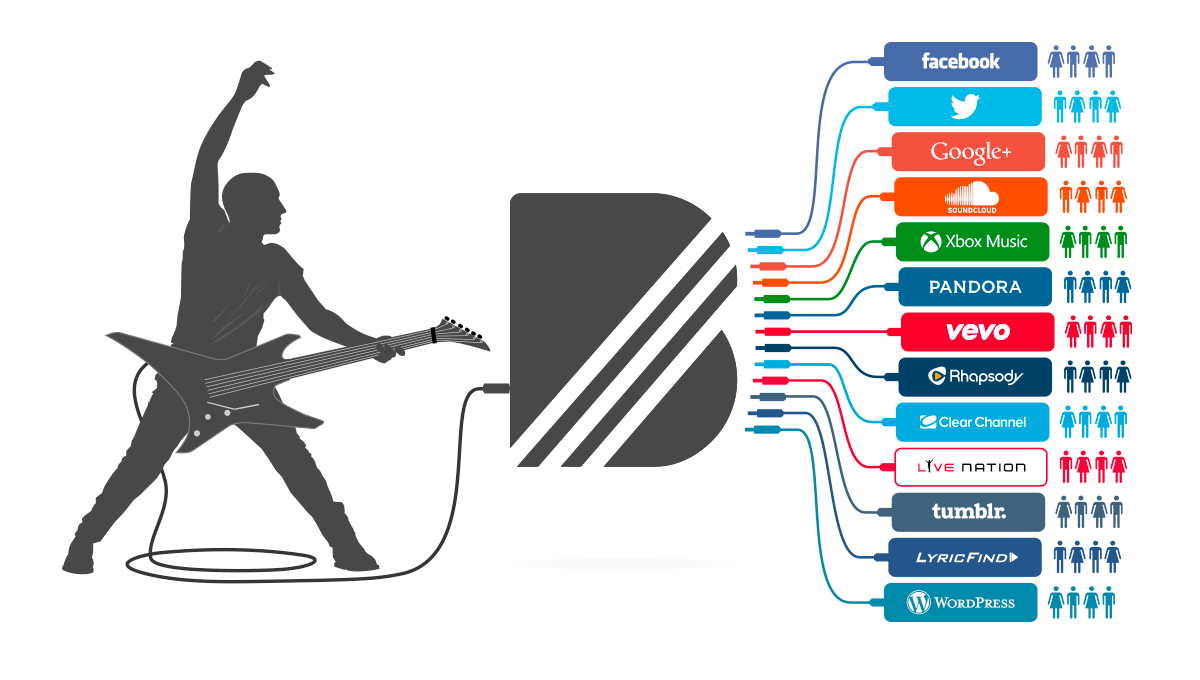
This image provides a very simple and clear way to articulate the value delivered via an API driven platform–showing users what BandPages does in a single image.
I wish every API I came across had an image like this, demonstrating what value the API delivers, in a very visual way.